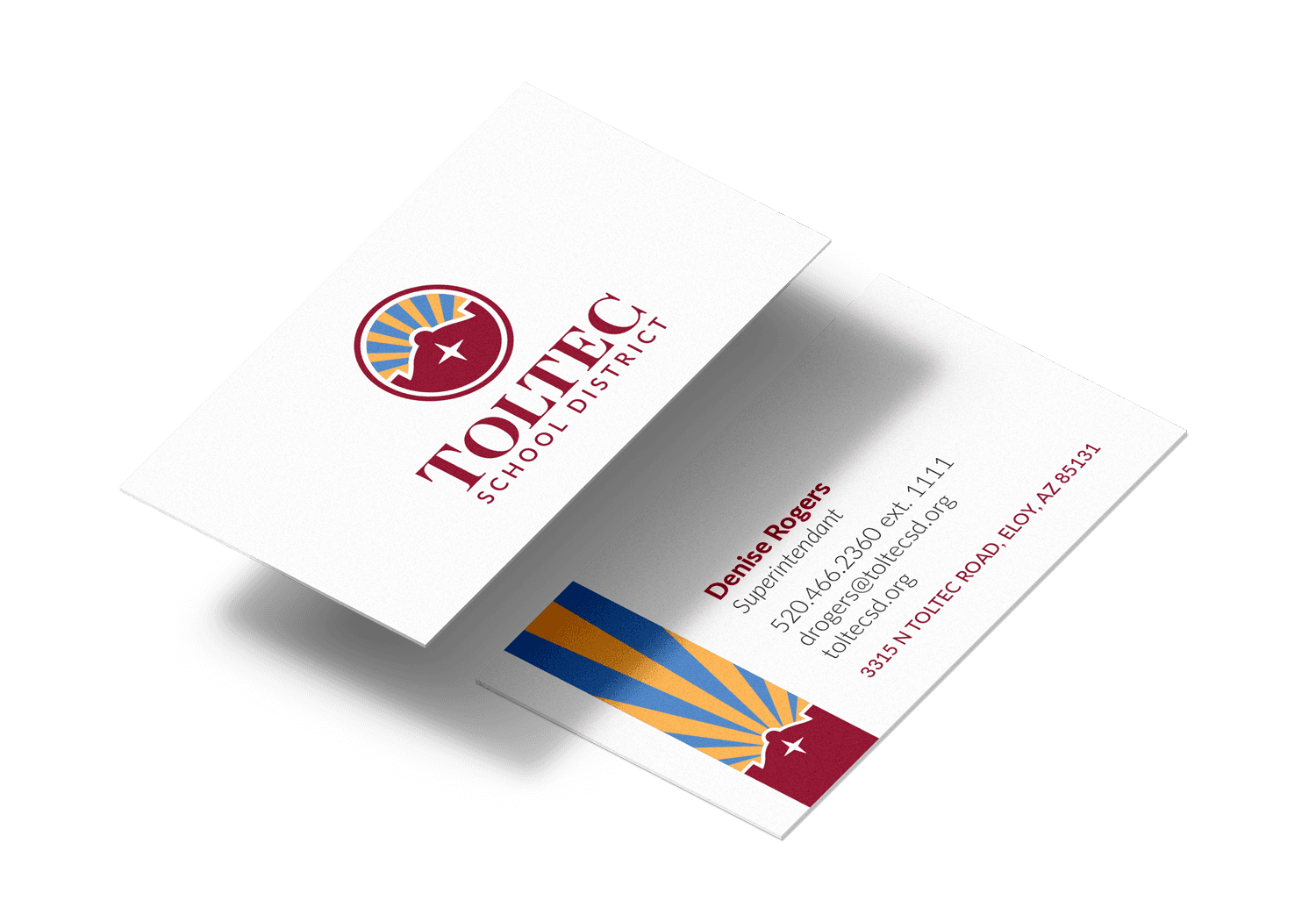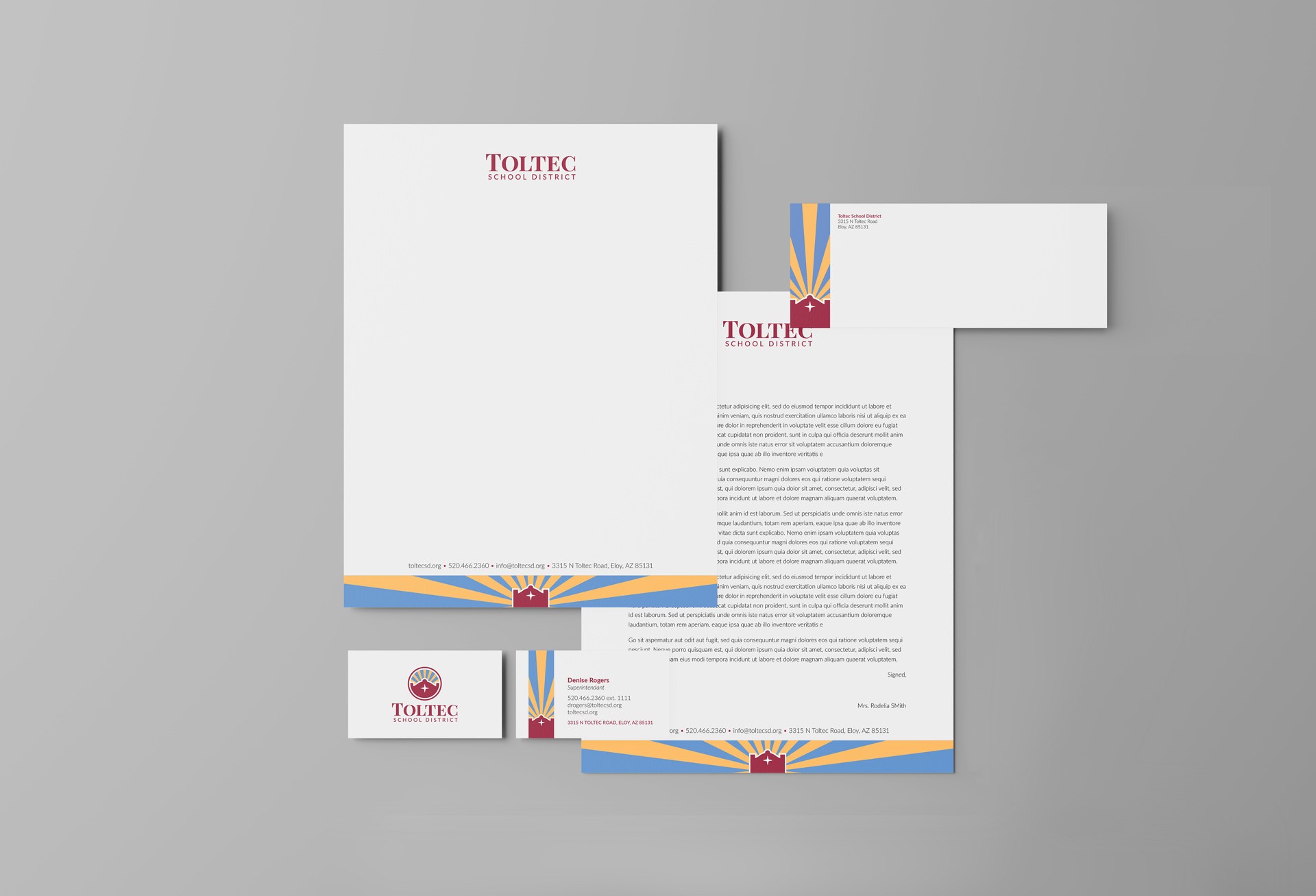
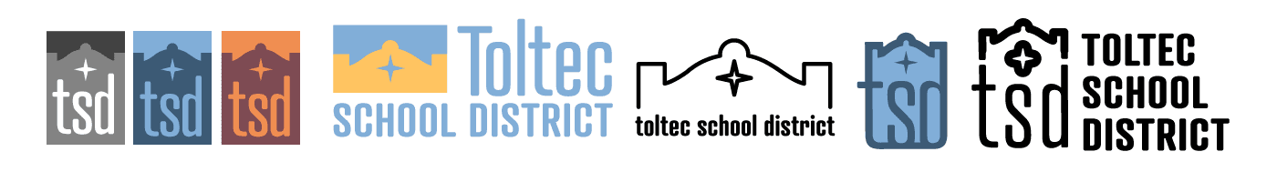
For my senior project I decided to take on redesigning the identity of a local school district. My goal was to modernize it but keep it friendly and bright, as well as keep the historical elements the old logo was based on - the outline of the original 1900's schoolhouse.
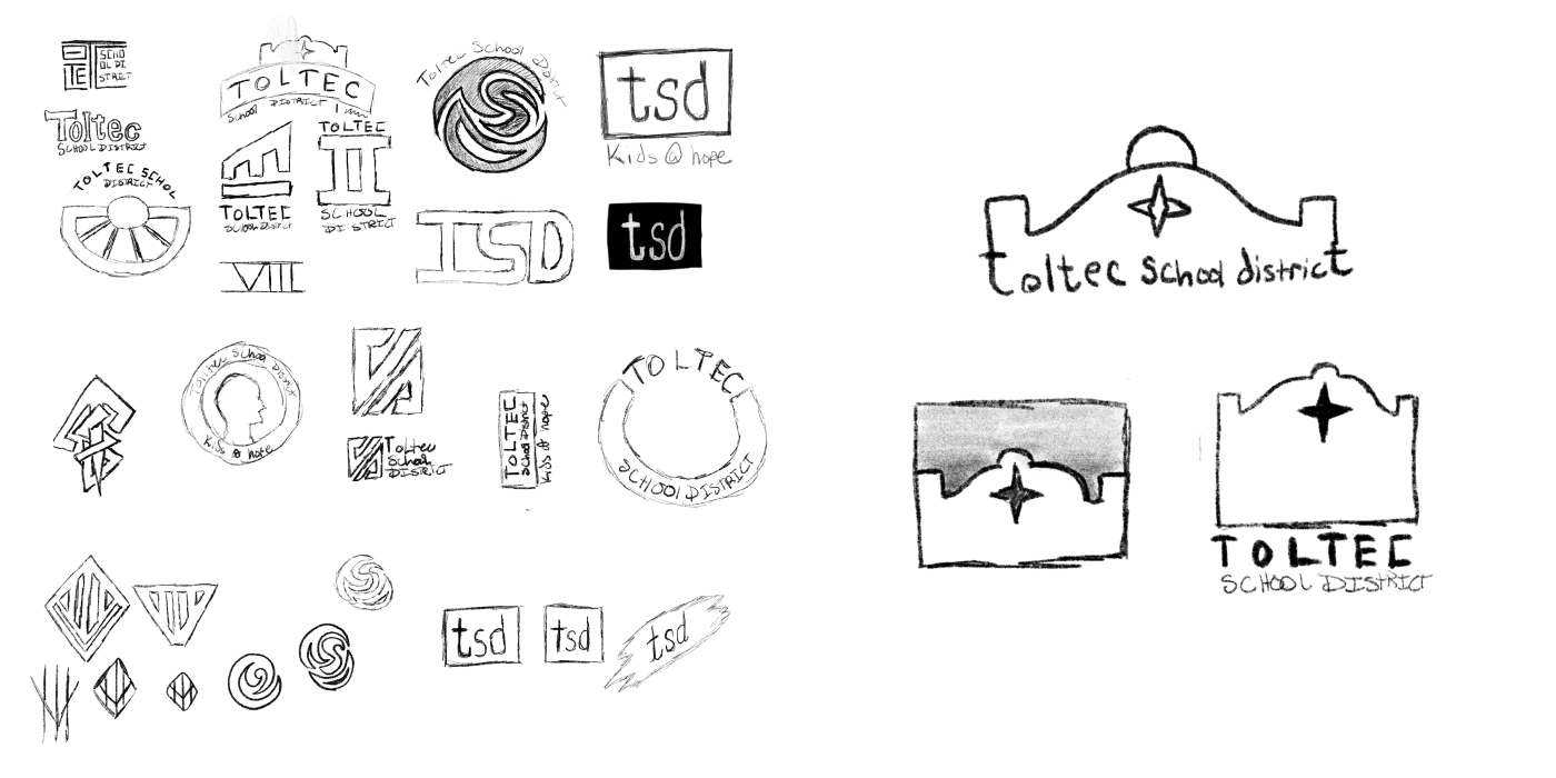
Initial sketches and concepting
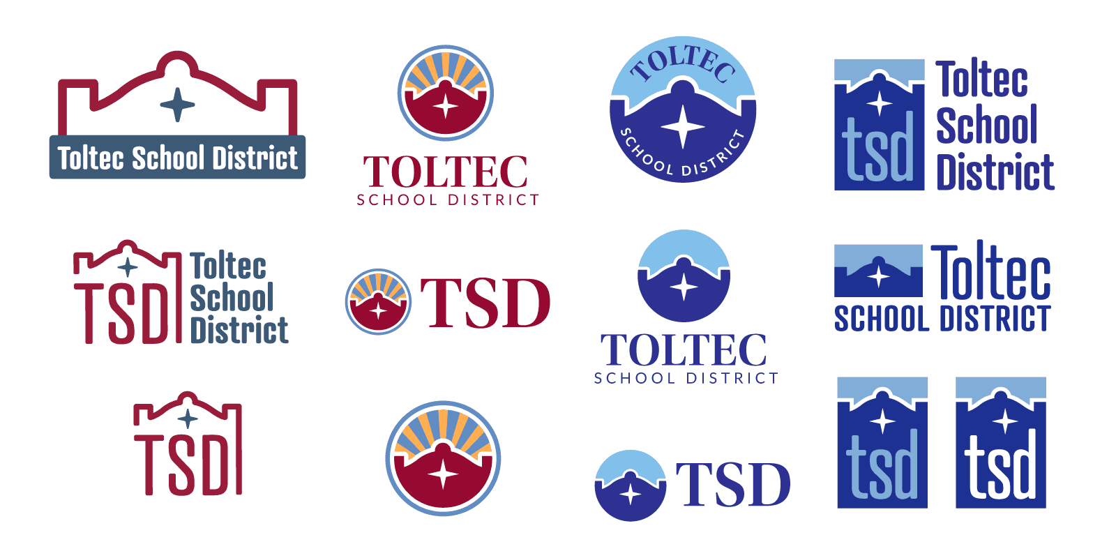
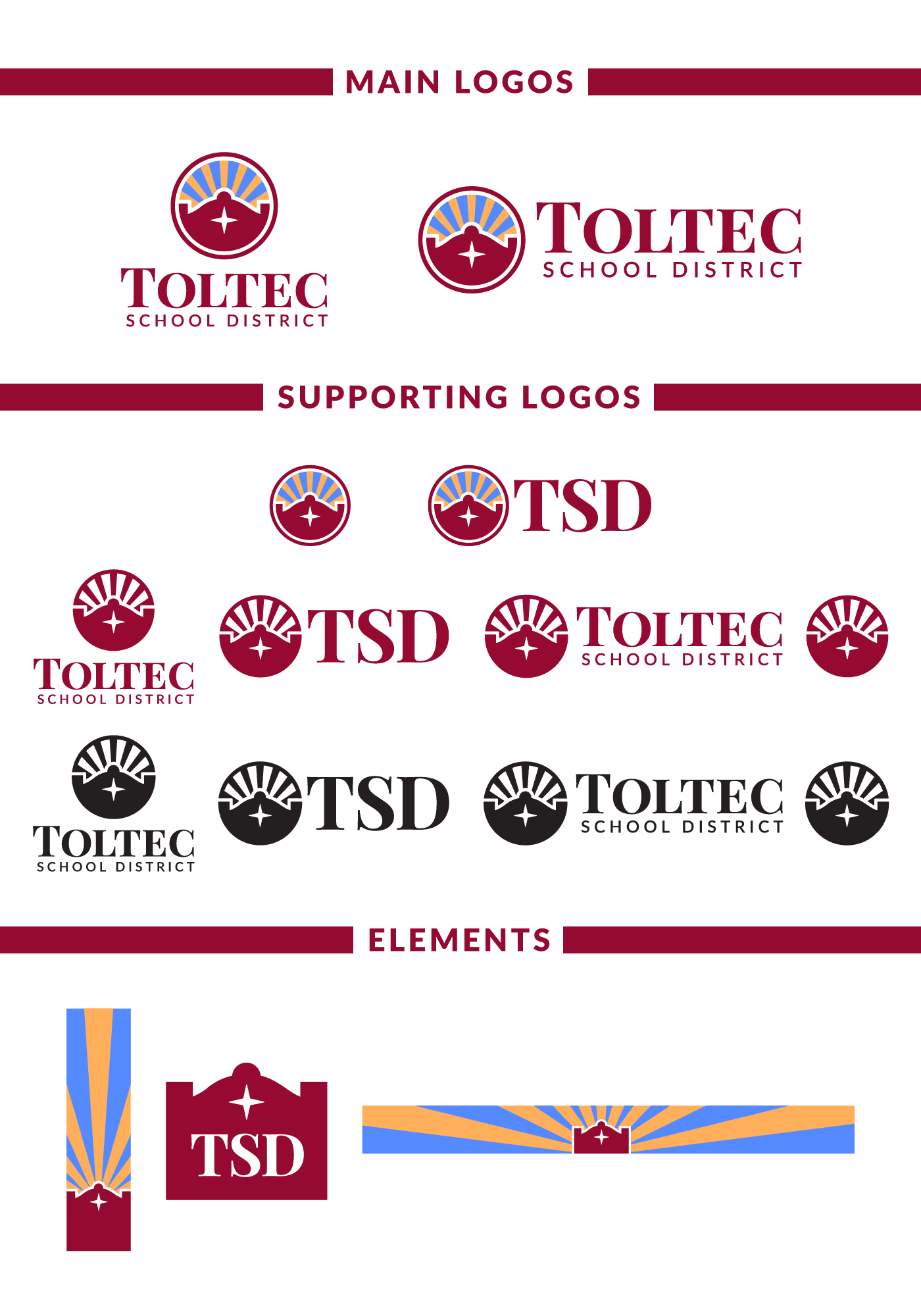
After looking over my progress with my advisor, I moved forward with middle version of these three concepts. The schoolhouse outline, encapsulated in a circle, with the sun rays above it, reminiscent of the Arizona flag.
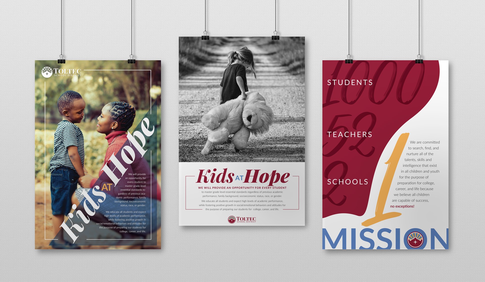
Part of the project was to also design some posters for the district to use. Two of these posters highlight the schools participation in a program called "Kids at Hope". The other highlights the number of students and teachers in their district, while also outlining the district mission.
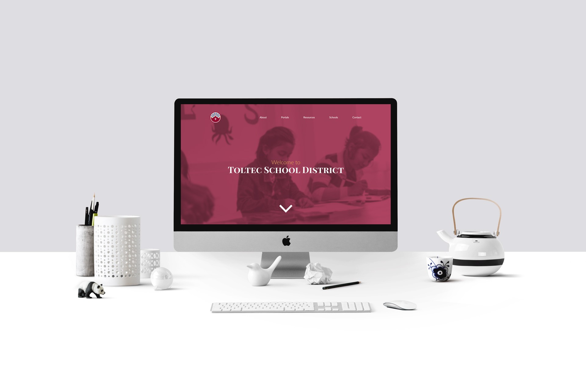
The website was also part of the redesign - updated to be more modern as well as being slightly easier to navigate.
The new colors are used liberally in the design, to make the website more vibrant and navigable. The current website has many links and webpages hidden deep inside the website, where users have to dig around to find them - the website also features a navigation menu on the top and side of the page.
Part of the goal was to make those pages more easily accessible to the website users.